The Problem
DLH Corp conducts yearly reviews of Head Start preschools to confirm they’re eligible for the next year’s federal grant. The software used to track that process was inconsistent, glitchy, and repetitive enough that teachers, schools, and reviewers were building their own workarounds just to get through it.
Together with DLH we asked: How might we create a more intuitive and seamless user experience for both reviewers and regional offices that enhances usability and improves workflows?
I was the Senior Interaction Designer on a six-person IDEO team: a project lead, a design research lead, a product designer, a visual communications designer, and our executive director. I ran the field research, designed and prototyped all six concepts myself, and presented them to DLH leadership.
The Process
Over seven weeks, kickoff to delivery, I moved through observation, interviewing, synthesis, concept generation, and rebranding with the reviewers, leadership, and my IDEO team, to hand off prototypes ready to test in the next phase.
- 17 interviews across reviewers, review leads, field operations managers, program specialists, and regional program managers.
- 3 reviews shadowed in the field, at the Fond du Lac Reservation, Kaysville, Utah, and Duluth, Minnesota.
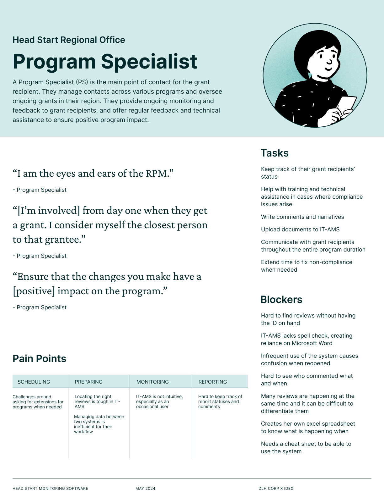
- 6 role one-pagers mapping who does what across the Office of Head Start and DLH.
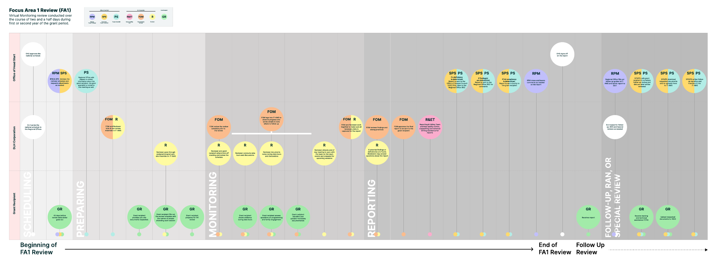
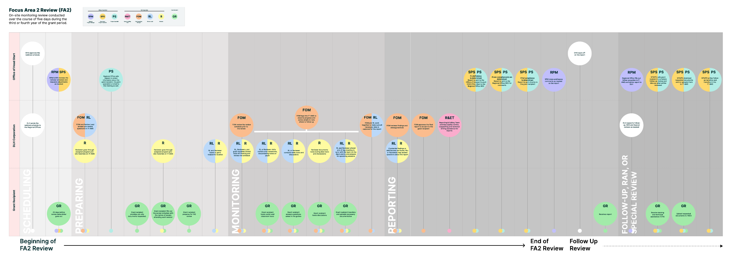
- 2 end-to-end journey maps of the FA1 and FA2 review process.
Working with the Head Start Community
The first step was shadowing the Head Start review process at grant recipient sites: the Fond du Lac Reservation, Kaysville, Utah, and Duluth, Minnesota. I spoke with preschool educators, Head Start parents, and reviewers, and got to look over their shoulders as they used the software.
“I use my own Excel spreadsheet to know when things are going to happen. We don’t have any one place to see it all.”
· Program Specialist
“One time we lost 69 files of data entered and the team had to reschedule.”
· Field Operations Manager
Two journeys, mapped end to end
Focus Area reviews come in two shapes: a two-and-a-half-day virtual review, and a five-day on-site review. I mapped both end to end across every role, surfacing handoffs and gaps no single interview would have caught alone.
Six roles, one review
A single review runs across six roles, three inside the Office of Head Start and three at DLH, and almost nobody in it had a clear picture of the other five. I wrote a one-pager for each: what they are accountable for, what blocks them, and where in the review each frustration actually lands.
 Head Start Regional Office
Program Specialist
“I am the eyes and ears of the RPM.”
Read the one-pager →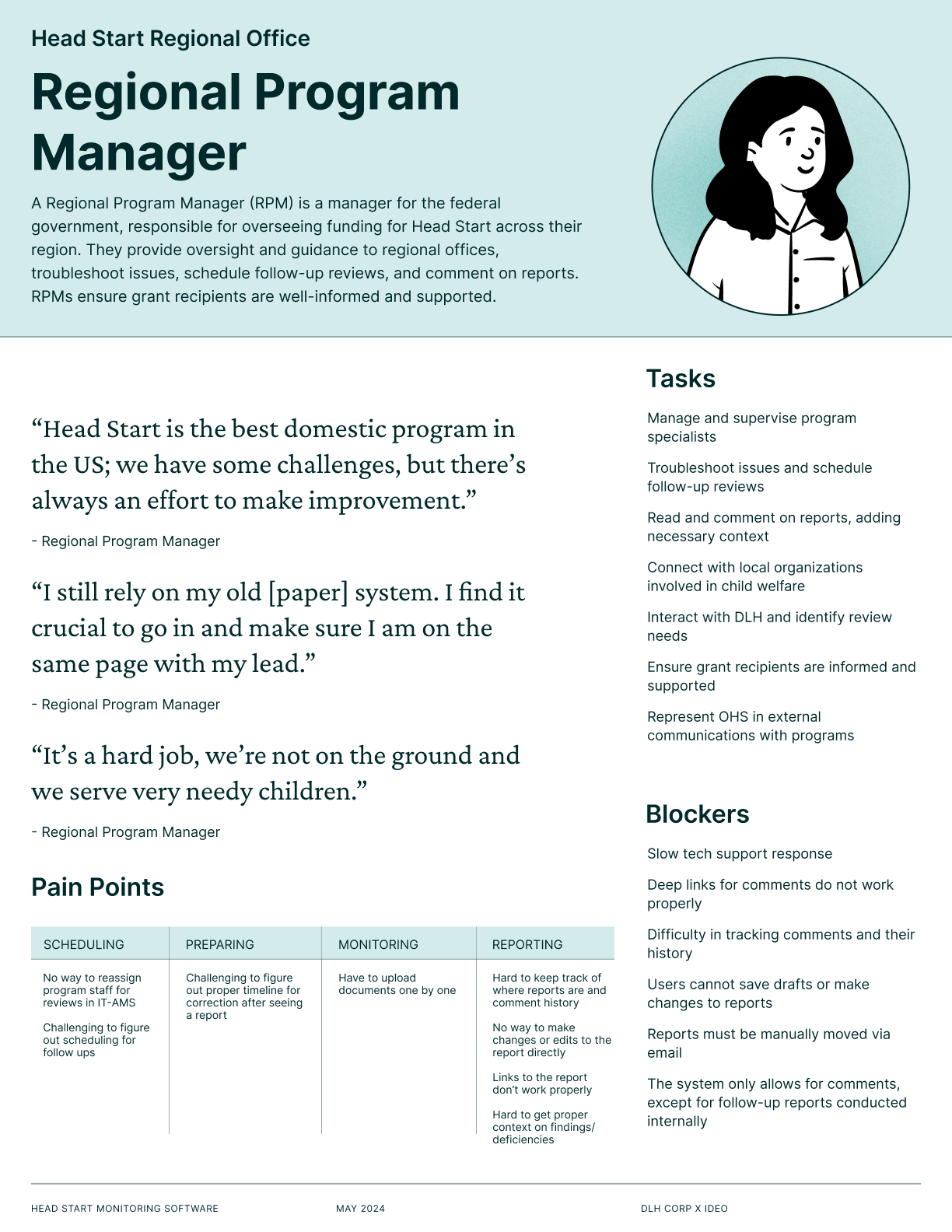 Head Start Regional Office
Regional Program Manager
“I still rely on my old [paper] system.”
Read the one-pager →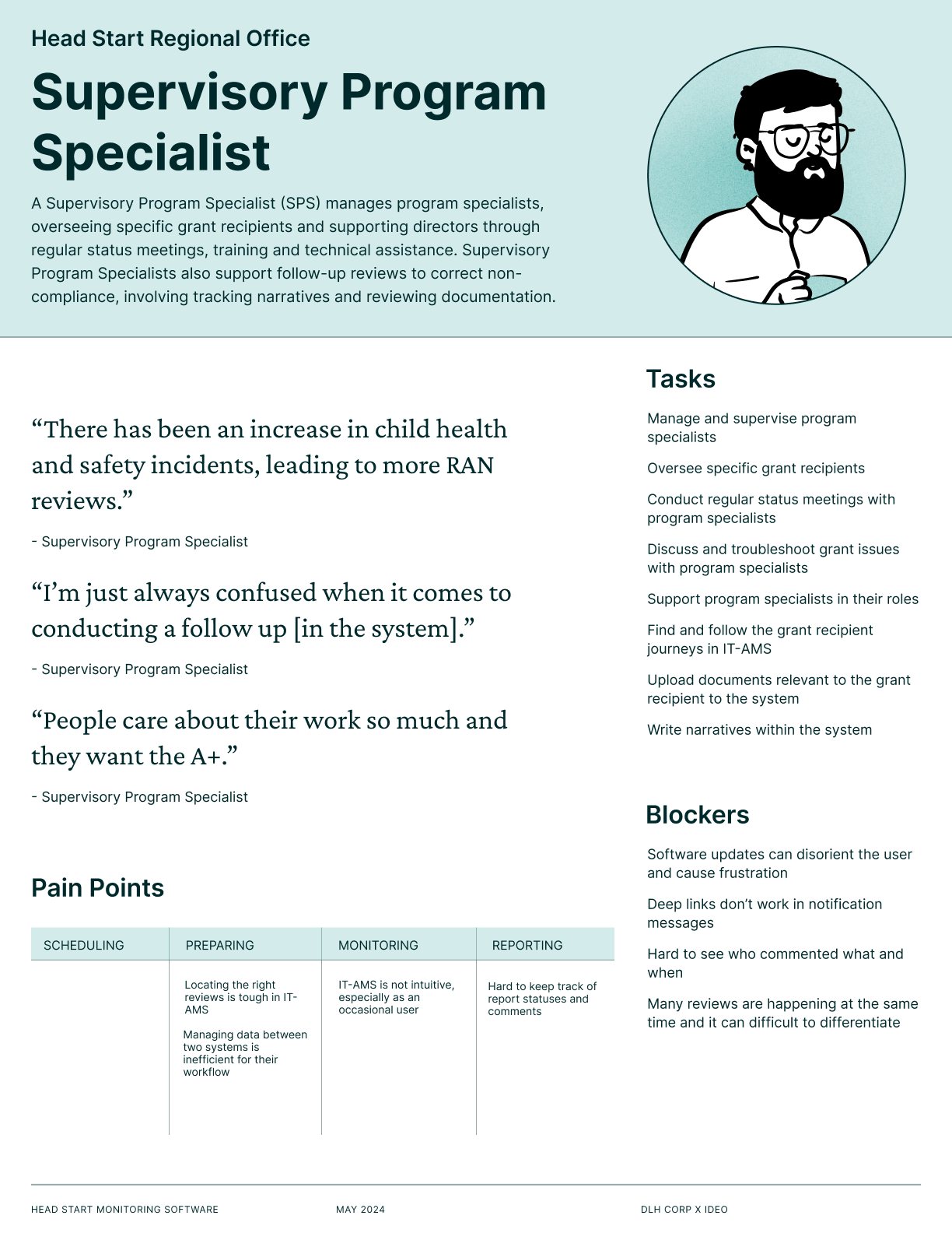 Head Start Regional Office
Supervisory Program Specialist
“I’m just always confused when it comes to conducting a follow up.”
Read the one-pager →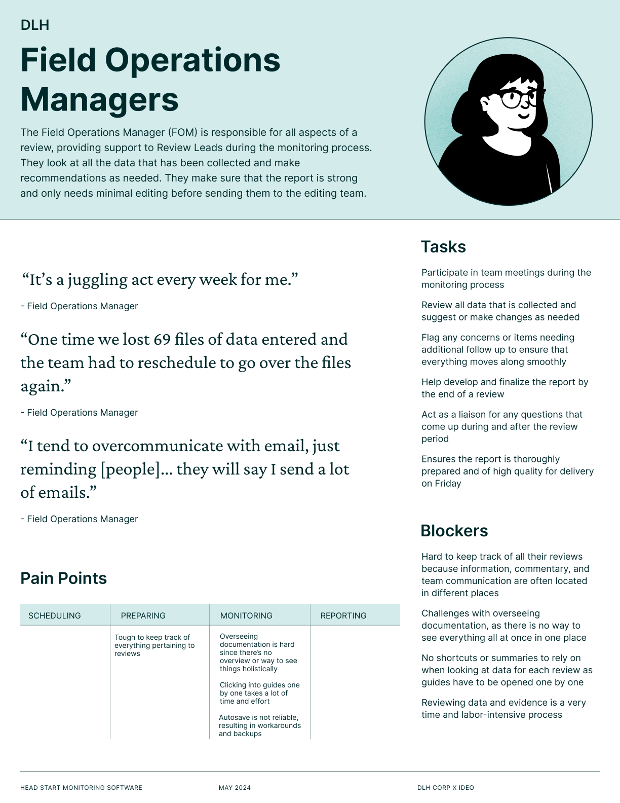 DLH
DLH
Field Operations Manager
“One time we lost 69 files of data entered and the team had to reschedule.”
Read the one-pager →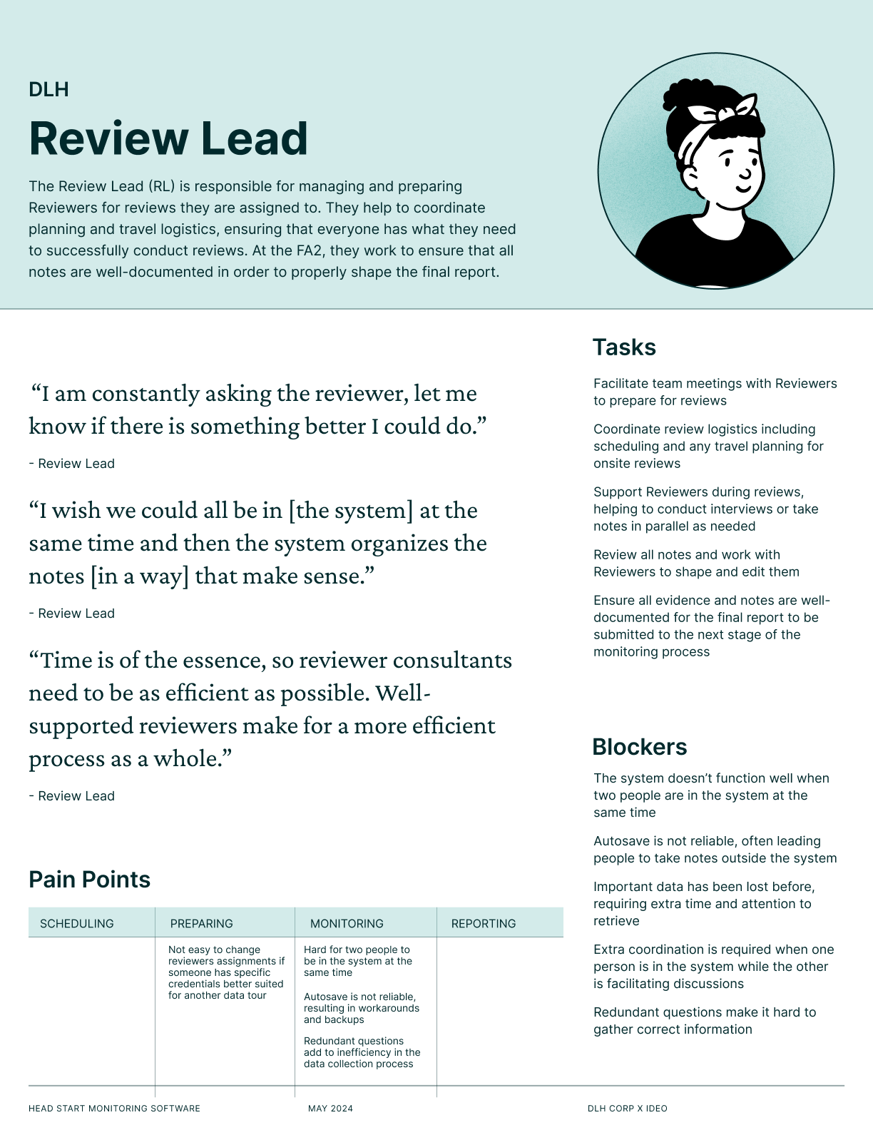 DLH
DLH
Review Lead
“I wish we could all be in [the system] at the same time.”
Read the one-pager →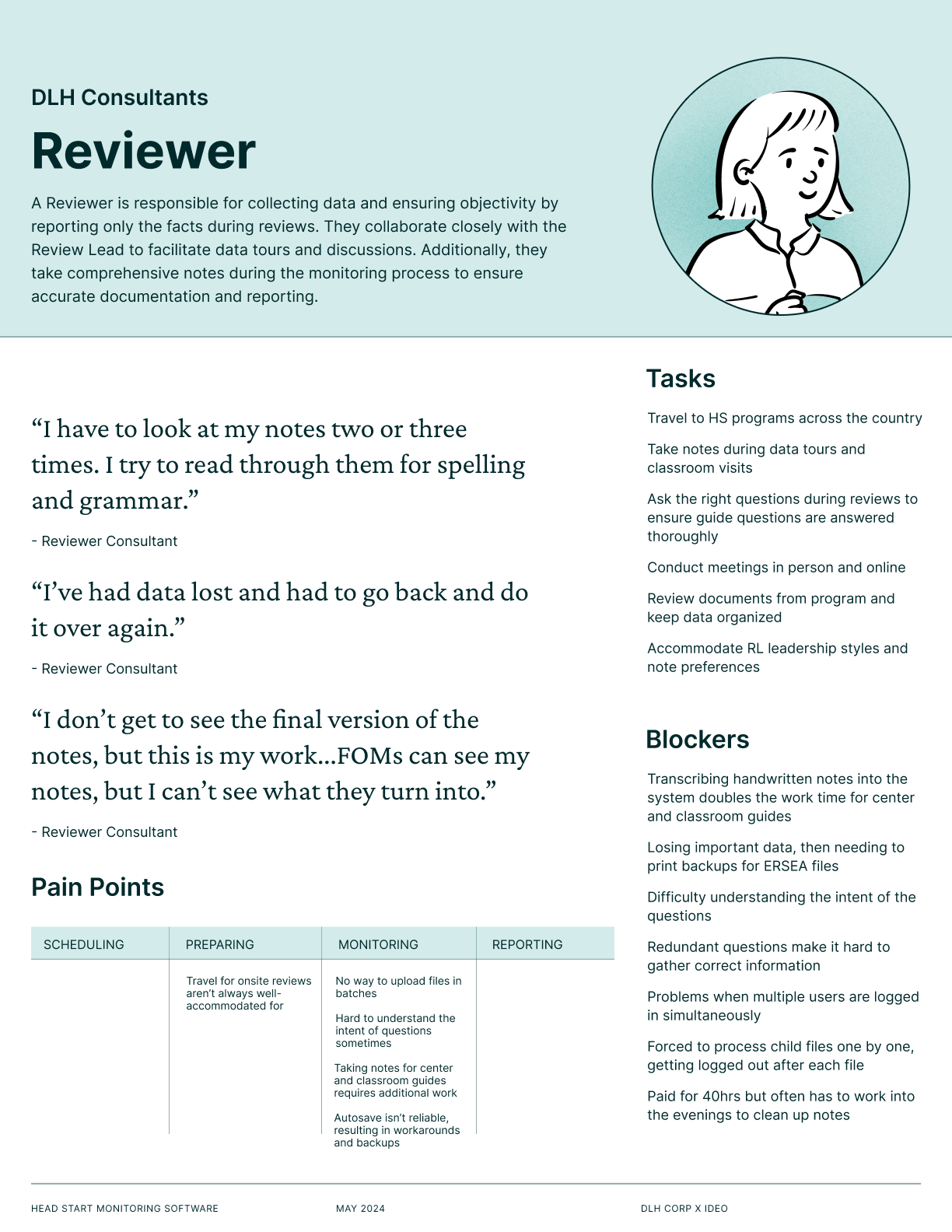 DLH Consultants
Reviewer
“I’ve had data lost and had to go back and do it over again.”
Read the one-pager →Read across all six and the same problem turns up in three separate roles, described independently and without prompting: work disappearing. That is the thread I pulled on later.
Through embedding with this community we arrived at five opportunities for the next version of this software: make communication trackable and traceable; shift from people informing systems to systems informing people; increase transparency in shared workflows; make collection reliable, comprehensive, and collaborative; and surface the urgent and actionable automatically.
The shift we were designing for
Across every role, the same six words kept describing the current system. We used their opposites as the test for every concept that followed.
Six roles run a single review, and almost nobody in it could see the other five.
The Solution
We generated far more than six ideas, then sorted everything into three tiers: six primary concepts, the ones that would do the most and could be built soonest; six secondary concepts straight out of research but less urgent; and a set of quick fixes that could ship without waiting on a redesign.
How we chose, and where it got uncomfortable
Picking between the six was the hardest part of the project, so we did it in the room. In the final session, DLH leadership spent a fixed budget across the six concepts, putting real weight behind what they wanted most; separately, we plotted the same six on an impact-versus-effort matrix.
The two exercises disagreed, and that disagreement turned out to be the most useful thing we made. Leadership’s biggest bets went to the Personalized Homepage, the most visible and ambitious of the six. The matrix favored the Review Tracker instead: close to the same impact for a fraction of the effort. Multiplayer Mode, despite addressing a frustration nearly every interview raised, scored lowest on impact of all six.
I argued for starting with Multiplayer Mode anyway, the concept our matrix ranked lowest. Three of the six roles had independently told us they’d lost work in the system, and during the shadowings I watched it happen: the system kicked a reviewer out mid-session and took their notes with it. Losing an afternoon of notes doesn’t show up on a matrix, but it’s exactly what makes people stop trusting a tool. We estimated the fix alone would roughly halve the time spent editing a review.
So the room held three different answers: leadership’s budget said Personalized Homepage, the matrix said Review Tracker, I said Multiplayer Mode. We handed DLH all six with the matrix, disagreement included, because the sequencing decision belonged to the team who’d build it, and the open tension was more useful to them than a ranked list that hid it.
The Concepts
Personalized Home page
Customizable homepage with real-time updates and schedules, offering role-based landing pages with advanced search functionality.
Review Tracker
A progress tracker for the entire lifecycle of a review, from scheduling to reporting. Keeps track of changes, comments, and ownership, eliminating the need for manual tracking.
Multiplayer Mode
Lets multiple people work in a guide at the same time: viewing questions, taking notes, leaving comments, addressing feedback. Earlier attempts at working together in the system had ended in lost work, so this concept had to make collaboration safe before it made it fast.
AI Transcripts
Automated transcription and AI-assisted note summaries, retaining details and speeding up note-taking to save time for reviewers and allow for more efficient workflows.
Document Center
Centralized hub for uploading documents with the right guides to reduce search time, ensure data safety, and support batch uploads.
Reviewer Mobile App
A companion app for field reviewers, integrating note-taking, photo capturing, schedule viewing, and AI voice dictation, eliminating the need for paper reports.